SACA PLUS SALES ANALYSIS DASHBOARD
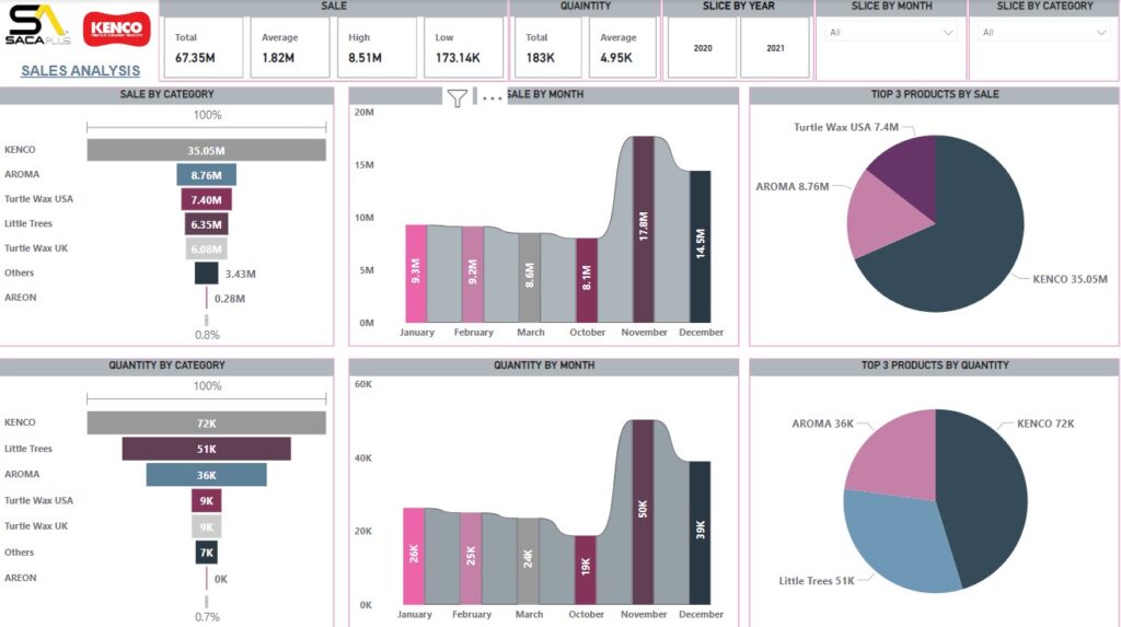
The “SACA Plus Sales Analysis” dashboard, primarily focused on the sales and quantity of products by category, month, and customer. Here’s a detailed description of the key sections and data points presented:
Key Metrics:
Total Sale, Average Sale, High Sale, Low Sale, Total Quantity & Average Quantity.
Filters:
Slice by Year, Month & Category
Sale By Category:(Funnel Visual)
Total Sales By Product / Category like KENCO, AROMA, Turtle Wax USA, Others.
Quantity By Category:(Funnel Visual)
Total Quantity By Product / Category like KENCO, AROMA, Turtle Wax USA, Others.
Sale By Month (Ribbon Visual:
Total Sales By Month like Jan, Feb, March….. Dec.
Quantity By Month (Ribbon Visual):
Total Quantity By Month like Jan, Feb, March….. Dec.
Top 3 Products Sale By (Pie Visual):
Top 3 Products by Sale
Top 3 Products by Quantity (Pie Visual):
Top 3 Products by Quantity.
This dashboard offers an in-depth analysis of sales and quantities, broken down by various categories, months, and customers. It provides a clear visual representation of the sales performance of different categories, trends over months, and contributions from different customers. The bar and pie charts help in easily identifying key areas of strength and potential improvement.
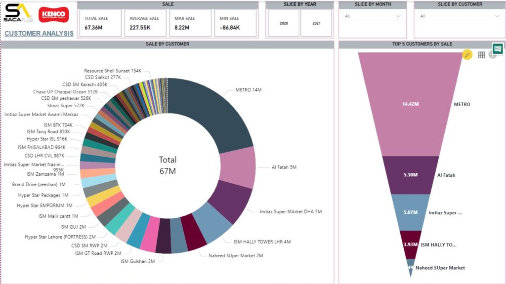
SACA PLUS CUSTOMER ANALYSIS DASHBOARD
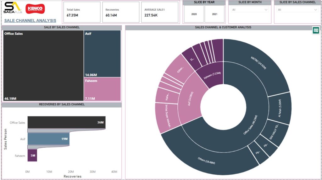
SACA PLUS SALES CHANNEL ANALYSIS DASHBOARD
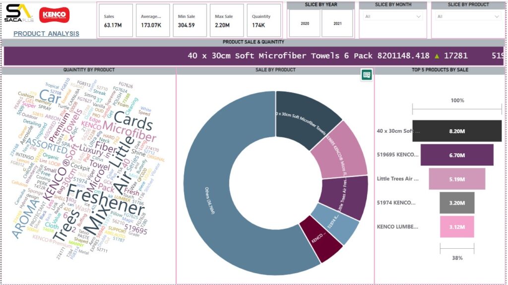
SACA PLUS PRODUCT ANALYSIS DASHBOARD


